Update!: Jerk of Art

It’s naïve to expect anything in the way of nuanced criticism from The Brooklyn Paper, but the unlubricated Andy Rooneying to which it subjected Work of Art on the front page of the rag’s arts section last week is over the top, even for a publication that inexplicably continues to publish Michele de Meglio’s insipid shopping column.
The so-called review of winner Abdi Farah’s Brooklyn Museum show is headlined “Work of Schlock,” for starters — the more measured question mark you see in the online edition is not present in the print version — and it barely addresses the art show at all, in the end. Critic Stephen Brown is far more interested in indicting the reality-television genre with musty generalizations, and gruttering about the taint it’s brought to the Brooklyn Museum, than in examining Farah’s pieces on their own merits and drawing a pertinent conclusion. Brown’s nom du column is “The Butcher of Flatbush Ave. Extension,” an appellation that’s hardly as fearsome as he thinks to begin with and regrettably illustrated with a cartoon from the peeing-Calvin school to boot, but editorially there’s more fuckery than butchery in evidence, starting with a shot at jaded condescension that sails well wide of its target:
Given how quickly Farah will likely vanish from the public attention granted him by the Bravo TV series, he at least deserves a moment for that same public to consider his work on its own merits — before turning to the larger superficial issues raised by the existence of this show in the first place.
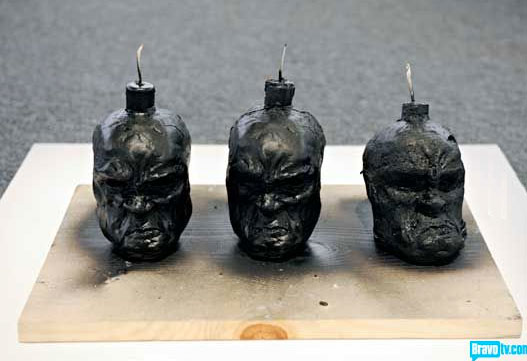
“The larger superficial issues”? Brown likely means “the larger issues of superficiality,” but it’s not as though he addresses those, either; he settles for going on to complain that the 11-piece installation focuses too much on death:
Taken as a whole, the exhibit evokes a visit to the morgue; there are so many supine figures and body bags that a museum goer might not think she’s checking out an exhibit related to “Work of Art,” but rather an artistic interpretation of “The Wire” or “Dexter.”
Brown seems unfamiliar with the idea that art often wrestles with mortality in ways that make the viewer uncomfortable — that that is often art’s entire purpose — but hey, at least we know he watches good TV, the kind on pay cable, and doesn’t fuck around with any of that tripe on basic cable. Or with proper hyphenation.
Brown also seems estranged from the concept that a museum relies at least in part on paying customers in order to continue existing, which the partnership with WoA surely helped with, at least temporarily; he’s very disappointed in the Brooklyn Museum for stooping to Bravo’s level — so disappointed that he decides to interpret a curator’s introduction to Farah’s exhibit as sharing that disillusionment, when in fact the quotations don’t indicate anything of the kind:
[Brooklyn Museum deputy director of art Charles] Desmarais conveys the reservations the Brooklyn Museum likely felt when considering this endeavor, describing it as an “experiment in serving the museum’s audience in new ways.”
“Reality television … offers a dynamic new way for viewers to encounter a work of art,” he says.
Neither of those sentences conveys reservations, to me; this is not to say that the museum’s management didn’t have reservations, or hope for a different winner, but somehow I doubt that Desmarais is going to undermine his own exhibition by shit-talking it in the introduction.
On and on this goes, with Brown calling reality television a “grotesque and disfigured,” “inbred” descendant of the art-crit tradition, “completely devoid of artistry” itself, and sniffing that the program’s viewers may prefer to sit on their asses on the couch making “superficial judgments” to seeing Farah’s installation for themselves. You’re doing a heck of a job there, Brownie.
And then, this:
Farah is not primarily to blame for the feeling of emptiness that accompanies reality TV’s successful invasion of the Brooklyn Museum. Countless artists have teetered on the edge of commercialism — heck, the Andy Warhol exhibit is right down the hall, in the same space where the Takashi Murakami show was last year.
But Farah lacks the key ingredient for those two giants of commercial art: irony.
…Jesus. What? Not one specific note on what is to blame, on where Farah’s work lacks irony (a word I suspect Brown is using incorrectly here), on why a reference to commercialism is relevant to Farah’s work — which, actually, it is, given the visual quotation of the Air Jordan ads that Brown himself mentions earlier in the piece. None of that. Just a throwaway comment on Warhol, which Brown’s editor probably made him put in and which doesn’t indicate to me that Brown understands what Warhol is about either. Farah’s work does tend to lack irony, but irony isn’t a prerequisite, and I can’t take Brown’s word for it in the first place, because I don’t know what he even saw. Forget a significant analysis; I’d settle for a basic description.
I haven’t seen Farah’s show yet, so I can’t speak to these specifics either, but if I were reviewing it for publication — or, rather, mugging it on Eastern Parkway for the benefit of the 28 bored diner patrons who read BP in a given week — I’d have something to say about the art itself, instead of banging on like a shitty stand-up comedian about how reality television is ruining everything. It isn’t, actually, and saying it is in 2010 undermines the rest of your argument. “Work of Schlock” is exactly that, an undisguised broadside trying to pass itself off as a review when it provides no information about the art itself, no reported material on the collaboration between show and museum (i.e., how it’s set up, how it’s paid off so far, remarks from curators at this or any other museum), and no innovative or entertaining commentary about reality TV.
The only “irony” I can see here is that, from what I saw on the show, Farah had trouble distinguishing what his own art is about — identifying and working within a framework that’s meaningful to him — and a half-competent review would have addressed that, but this review doesn’t know what it’s about itself. A tired and dishonestly argued position on televised competition doesn’t qualify as “a subject,” and Brown doesn’t qualify as a critic if this splintering soapbox is the best he can do.
*****
updated September 13, 2010
As it turns out, cranky reviewer grandpa Stephen Brown accidentally identified the leading issue with the Abdi Farah exhibit: “the reservations the Brooklyn Museum likely felt when considering this endeavor.”
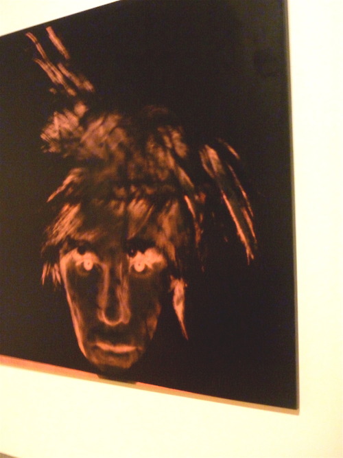
I visited the museum yesterday, as much to fit in the Warhol installation on its last day as to see Farah’s work, and the difference between the exhibit spaces tells you everything you need to know. Selections from Warhol’s last decade of work occupied parts of two different floors, many receiving entire walls to themselves, and the accompanying curatorial comments praised certain pieces while seeming not to know (or unprepared to admit) much about the man or the arc of his creative life. Other pieces, ones with more energy and danger, went unremarked.
 The work needed a more challenging treatment, in my opinion, but I can’t argue with the physical installation — real thought went into the ordering, the spaces, the sightlines. Complimenting the way an exhibit is hung sounds like bullshit, but going from the reverently arranged Warhol to the embarrassed, inadequate corner reserved for Farah, I realized that it does make a difference.
Farah gets a single room. The room itself felt slapped up; museums and galleries use temporary or modular walls all the time, but it felt particularly flimsy here. The works didn’t have room to breathe; “Libation,” the two Air-Jordan-esque figures, is quite beautiful in person, but it should have had its own space, and even with only 11 total works on display, the paintings and drawings feel cramped. Brown may have had a point about “Tuskegee” as well — its intent is both more evident and better realized than Brown gave it credit for, although I don’t think it’s quite “done” — but it’s one of those pieces that has…I don’t know how to explain it, exactly, so let’s try “a long finish.” Things keep happening to what you think about it while you stand there. The trouble here is that it’s not all that big, and other works get into your peripheral vision and flatten it out. …Sorry, I have such poor spatial functioning that talking about how I see visual art is like trying to play lunch on the cello.
The overall vibe is one of regret; the museum is ashamed of its involvement with Bravo and Farah, and did the bare minimum to fulfill its end of the deal. I would also bet American money that someone at the museum told Bravo not to let Miles win because his work would require more space and more spatial care, and they just didn’t want to make the room.
Miles is a better developed artist and able to create more emotional dimensions with his work, so if that’s why he didn’t win, it’s crap — but Farah isn’t bad. He’s very good, but he’s young, and he doesn’t follow through all the way sometimes. So…fine, just say so in the notes. Give him a proper gallery vista, and let the work stand or fall. Take advantage of the opportunity in both directions, to teach, to talk about how we see things, physically and figuratively. Or let Simon de Pury hang the winner’s show; at least he has some insights, and some balls.
I stand by my original take on Brown’s review, which is dated curmudgeoning sans useful information, but the museum’s obvious ambivalence about Farah is just as bad, in a way.
Tags: "fine" art Abdi Farah Andy Rooney Andy Warhol Charles Desmarais dear sir or madam your writing is ass Michele de Meglio our friend English Stephen Brown The Brooklyn Museum The Brooklyn Paper TV Work of Art


Awesome analysis, Sars. I hope you sent it to the paper — it’d be a kick-ass letter to the editor.
Stephen Brown’s piece ( surely not a critique) is strangely similar to a book review where the writer never read the book, saw the movie, or even read the Cliff Notes.
He didn’t really describe and critigue reality TV, Work of Art, or the museum exhibit. I seriously wonder if his rant was based only on fleeting impressions at most.
Well, for those of us who can’t make it to see for ourselves, I do hope you get a chance to peruse the thing and write a review with hands unhindered by clutched pearls.
The acuity of this piece is only enhanced by the Before and After quality given by the update. Thanks.
I’d also like to thank you for “… like trying to play lunch on the cello, which is so exactly how I’d want to express my own lack of visual orientation that I can’t not use it! With all appropriate attribution, of course.
Also, nicely repurposed Bushism, there, boss. Heh.